It’s always a privilege to be privy to talks by designers expounding on their own creations, as is the case recently when Jonathan Disley (top), Volvo Cars China and Asia Pacific’s Vice President for Design, decided to stop by Kuala Lumpur.
On the evidence of the new XC90 and the soon-to-launch S90/V90, few can deny that Volvo is on to a good thing from a design perspective. If you find the exterior styling of new Volvos invigorating, then the interior makeover has been nothing short of a revolution.

It was no surprise to learn from Disley that buttons and switches have always been a bane to interior designers; they are a necessity but introduces clutter to the dashboard. Once physical controls are ‘confirmed’ for production, it’s near impossible to alter the aesthetics and functionalities without incurring heavy redevelopment costs. Basically, you’re stuck with them for at least one model cycle that lasts at least five to seven years, if not longer.
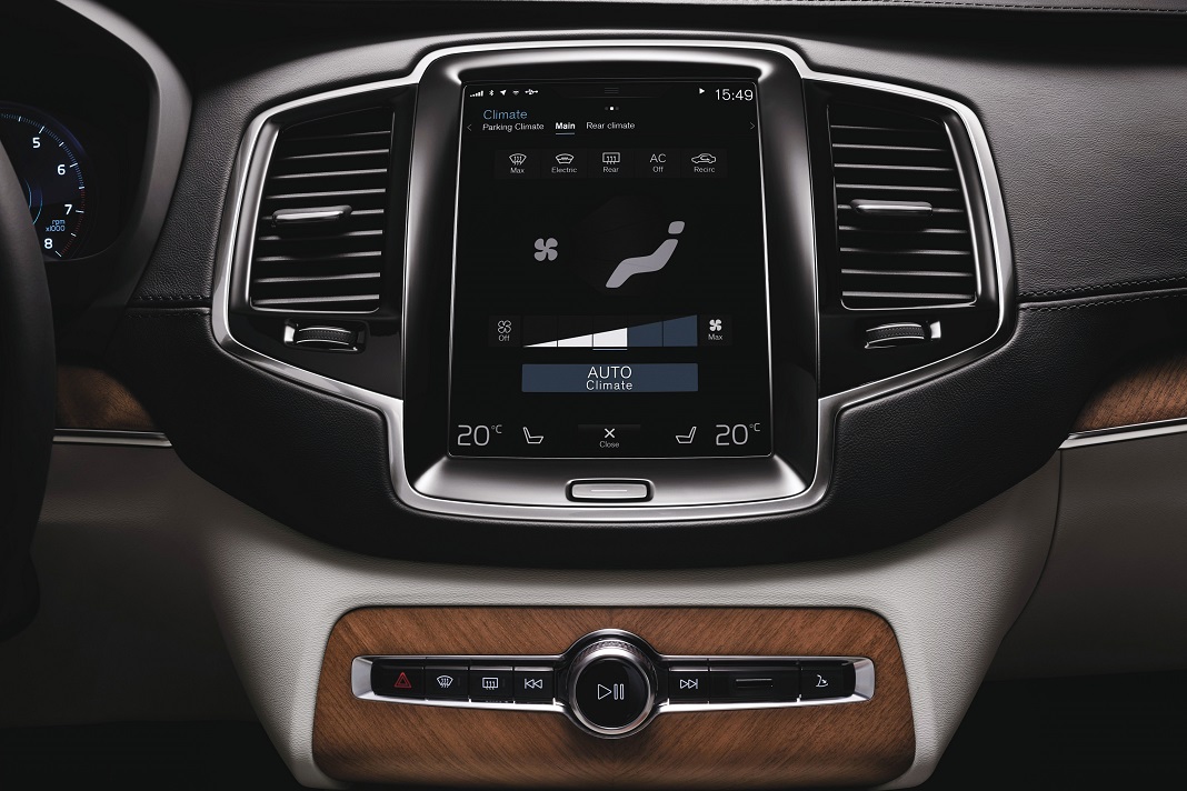
Disley revealed that the inspiration behind Volvo’s new Sensus Connect infotainment system came from Apple’s iPad. Not only does touch screen technology solve the age-old issue of clutter, thus freeing the shackles that bound designers from penning a cleaner, more expressive design, but by virtue of being software-based, the system can be updated anytime, just like a tablet.

Some hardware switches have survived the cull of course – ignition, drive mode selection, park brake, demister, hazard, among others, but curiously, Volvo chose to stick with the physical controls for the entertainment system (i.e. volume, play button, etc.) and not the air-conditioning.
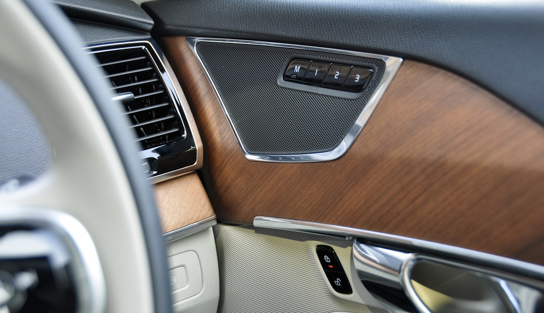
Volvo isn’t the first manufacturer to have embraced touch interface in a comprehensive manner and certainly won’t be the last. Make no mistake, to pack that much tech yet have an interface so clean and visually appealing is nothing short of cool. The minimalist approach allows for large swatches of natural materials (wood, aluminium, leather as found in the XC90) to shine through. Personally, I’m sold on the concept, and you’d be too if you ever find yourself sitting in a XC90.

But as Disley proudly quoted Jeremy Clarkson’s verdict on the XC90 cabin as ‘the nicest interior you’ll find anywhere this side of a Rolls-Royce Phantom’, a couple of us local hacks (who aren’t remotely as famous or as wealthy as Mr. Clarkson) can’t help but to query Disley as to why Volvo chose to have physical controls for the audio instead of air-conditioning which we humbly submit as the more critical one to have, particularly when the steering wheel already has dedicated buttons that control the sound system.

So as more carmakers move to exorcise unsightly buttons and dials from dashboards, I believe the decision as to which physical controls to retain will be harder than ever. Our extremities may have become more dexterous in the age of smartphones and tablets, but adjusting the temperature and fan speed on a touchscreen (such as that of the XC90’s) when driving can be a hit-or-miss exercise. Unless you have fingers shaped like a stylus or have the (mis)fortune of being endowed with dainty digits like Donald Trump, it can even be distracting at times, when it really shouldn’t be. Our reader review of the XC90 also touched upon this point.
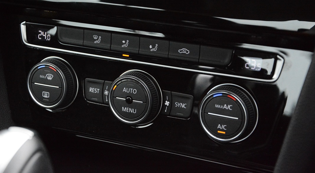
Disley justified the inclusion of physical audio controls on the basis of Volvo’s own customer research. I can’t possibly question the Swedish carmaker’s integrity in vehicular safety either; they remain at the forefront and are well on their way to achieving zero fatalities in road accidents involving Volvo vehicles. But it’s interesting to note that other premium manufacturers (case in point being the Germans) have also gone the minimalist route in interior design while retaining hardware controls for key functions such as air conditioning. Maybe that’s why Jeremy Clarkson likes them less than the Volvo.

